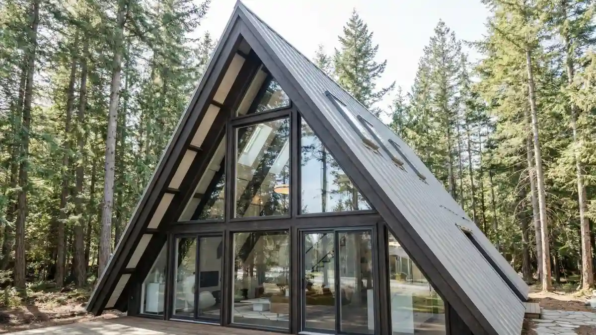
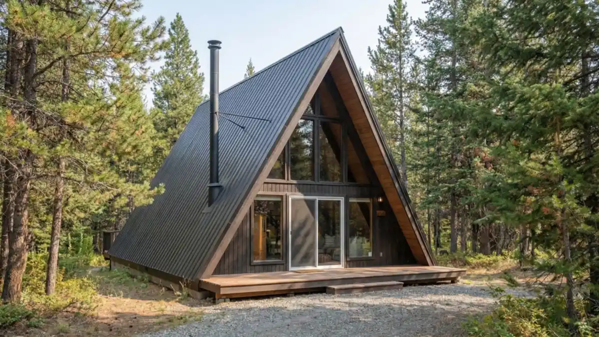
Cabin walls can feel either magical or maddening, right? One day you’re obsessed with those steep A-frame angles, next day you’re staring at them thinking, “I have no clue where a sofa is supposed to go.” I mean, small footprints, weird corners, zero storage… it’s a lot.
You want calm, modern lines. You also want a space that wraps around you after a long week, not just something that looks cute in a listing photo.
I’m not sure there’s one “correct” way to style an A-frame, but there are smart ways to make every inch work harder. From airy, minimalist layouts to layered, cozy maximalist corners, we’ll walk through interior ideas that solve real layout problems while still giving you that cabin-in-the-woods magic you’re actually craving.
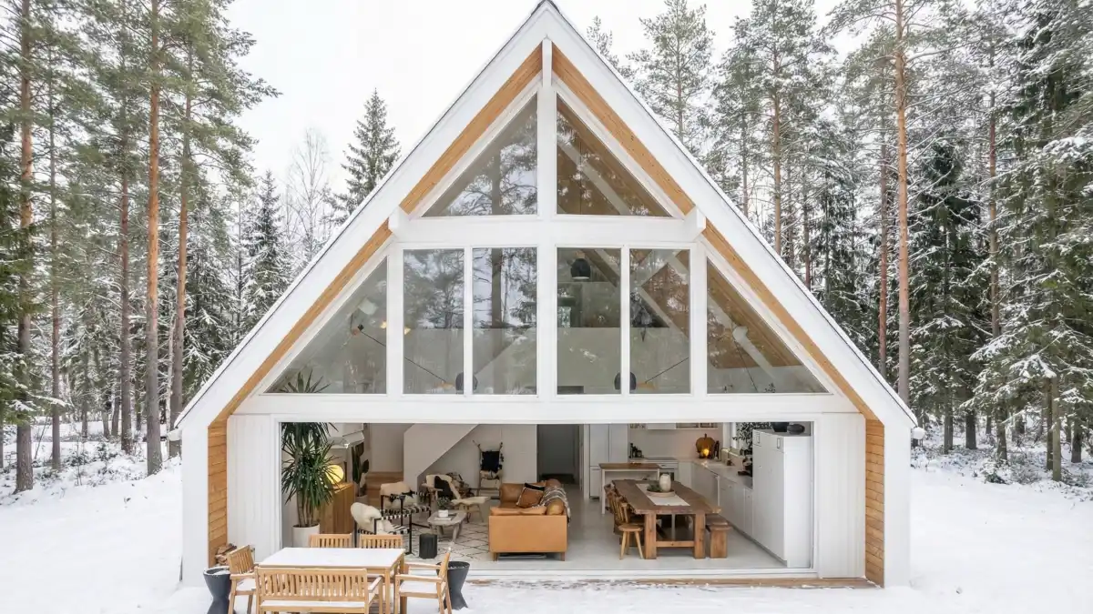
1. Luxurious Cognac & Crisp White Open Concept – Elevating the Rustic A-Frame to Modern Heights
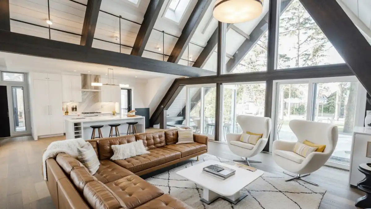
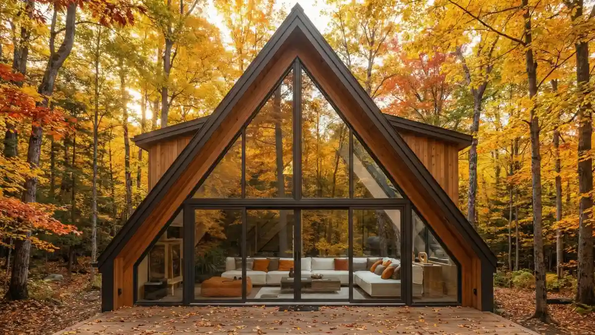
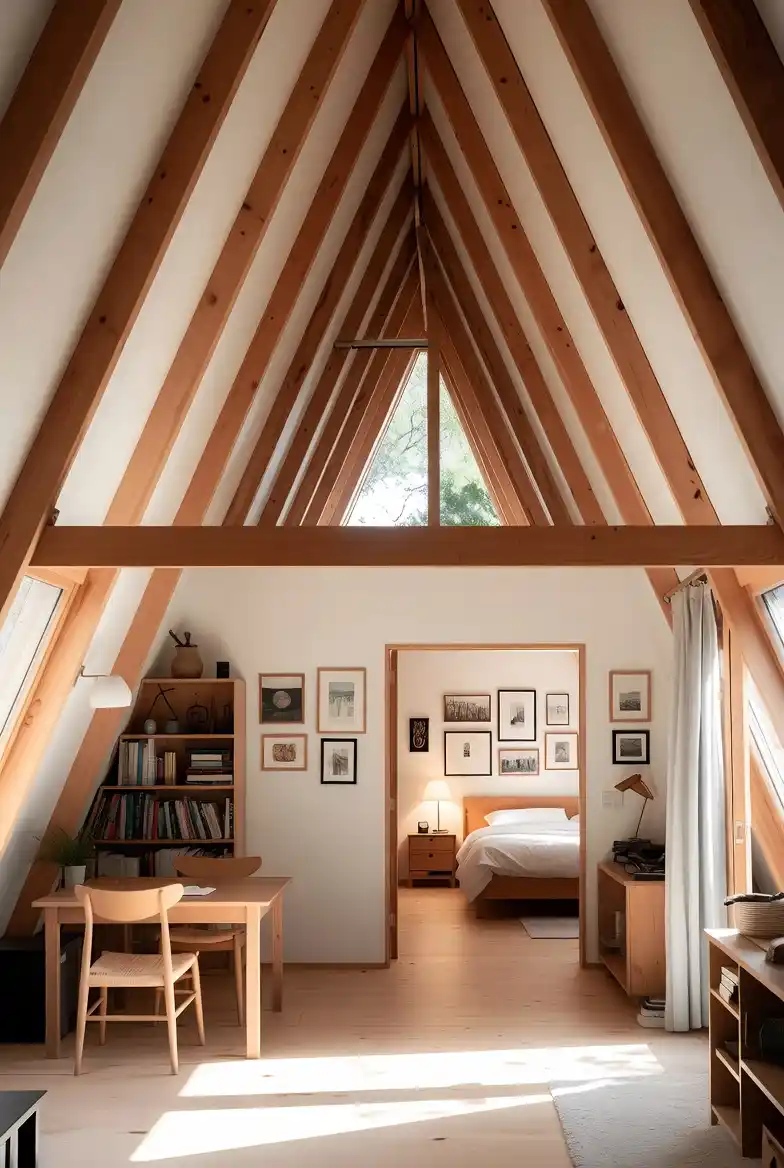
Seeing the scale of this room is genuinely breathtaking; it completely ditches the “cramped dark cabin” stereotype for something that feels more like a luxury penthouse dropped in the woods.
Painting the ceiling bright white between those massive, dark-stained beams highlights the architectural geometry without letting it dominate the mood, keeping things feeling light and airy despite the heavy structural elements. It is rare to find a layout that handles a massive open-plan kitchen and living area so seamlessly under such a steep roofline, but tucking the culinary zone under the loft creates a cozy, defined “room” within the larger volume.
Modern Softness: Balancing the rigid, sharp lines of the window frames with curved, white swivel chairs introduces a mid-century softness that makes the space feel designed rather than just built.
Anchoring with Color: Dropping a massive, warm cognac leather sectional into the center of the room provides a necessary gravity that stops the all-white aesthetic from floating away or feeling too clinical.
Loft Logic: Utilizing the space above the kitchen for a mezzanine adds usable square footage without blocking the spectacular double-height view from the main living area.
2. Autumn Gold & Blonde Scandi Lounge – Letting Nature Dictate the Color Palette
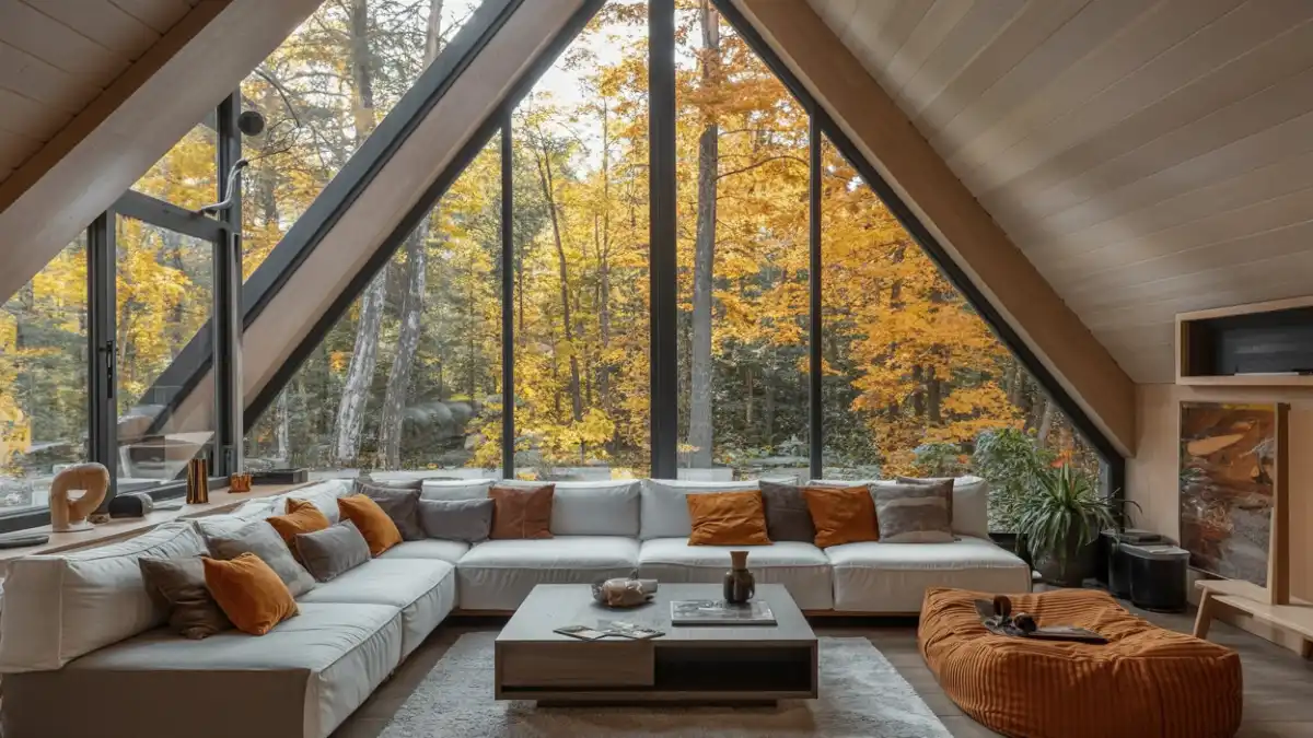
Opting for a whisper-quiet palette of pale blonde woods and creamy white upholstery effectively turns the room into a canvas, allowing that exploding autumn forest to act as the primary paint. It is a confident restraint; rather than competing with the view using loud wallpapers or dark stains, the interior steps back, letting the golden light filter in and naturally warm up the clean lines. Such a design choice proves that minimalism doesn’t have to mean “cold” or “stark,” especially when you let the seasons do the decorating for you.
Monochromatic Envelope: Cladding the walls and ceiling in the same light-toned timber eliminates visual breaks, creating a seamless cocoon that amplifies the natural brightness rather than absorbing it.
Seasonal Mimicry: Pulling that specific burnt orange shade from the maple trees straight onto the throw pillows and textured ottoman blurs the glass barrier, making the outdoors feel like an extension of the living room.
Low-Profile Lounging: Selecting an extra-deep, low-backed sectional ensures that not a single square inch of that million-dollar view is obstructed, maintaining the awe-inspiring verticality of the window.
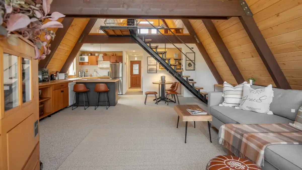
3. Warm Oak & Iron Spiral Loft – Maximizing Flow in Modern A-Frames
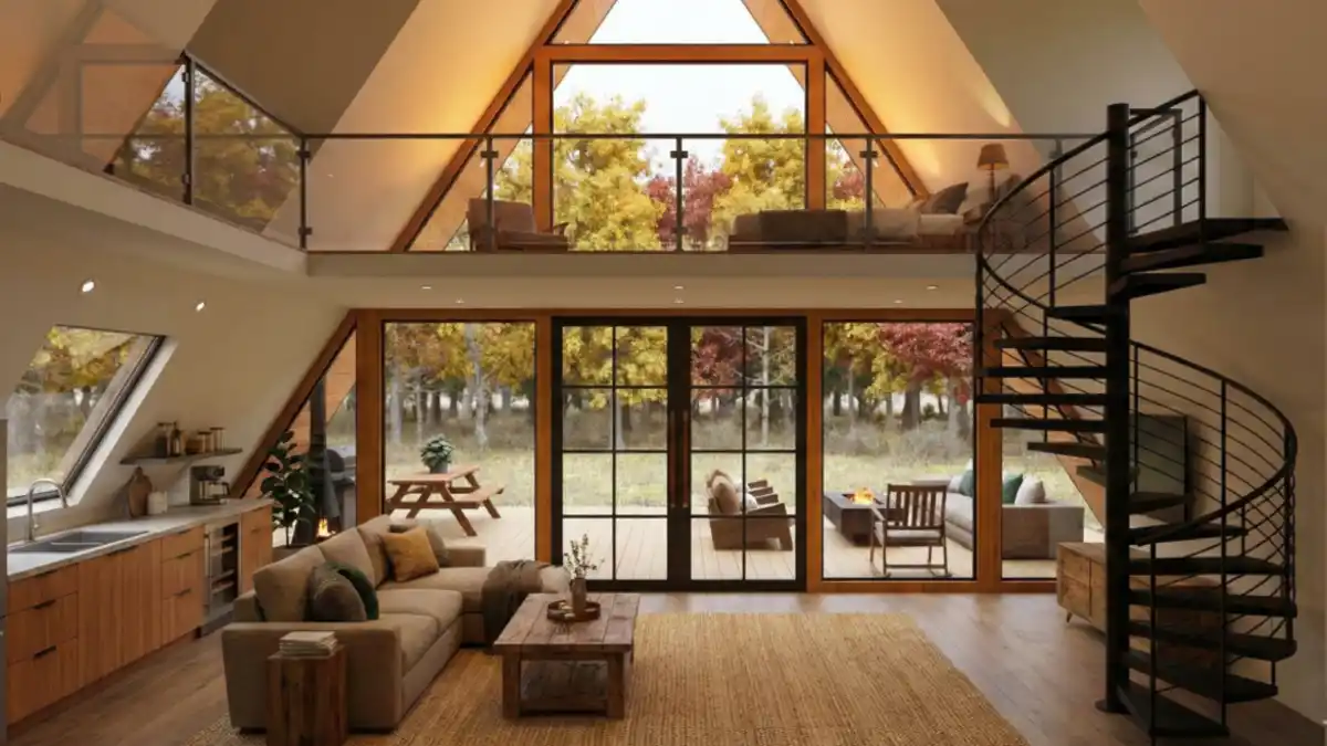
Integrating a tight black metal spiral staircase isn’t just a style choice; it is a brilliant maneuver to reclaim precious square footage in the main living area. Traditional straight-run stairs would have eaten up half the floor plan here, but that sculptural coil allows the kitchen and lounge to breathe while adding a striking industrial edge against the soft, warm wood tones.
It creates a layout that feels open and social, where the person cooking dinner is still very much part of the conversation happening on the sofa or even up in the loft.
Material Warmth: Pairing a chunky jute rug with the smooth floorboards grounds the seating area texturally, defining the “living room” zone without needing physical barriers that would interrupt the open sightlines.
Transparency Tricks: Installing a glass railing on the mezzanine level is genius because it maintains safety without visually capping the room, allowing the eye to travel all the way to the vaulted peak unhindered.
Linear Efficiency: Pushing the kitchen cabinetry along the lower sloping wall utilizes vertical space that is usually too short for standing, turning an awkward architectural cramp into a streamlined, functional culinary zone.
4. Sun-Drenched Scandi-Chic Living & Dining – Airy Modern A-Frame Sanctuary
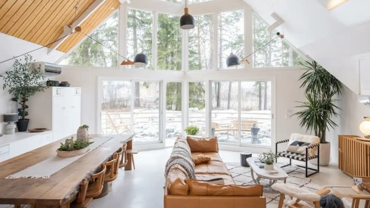
Stepping into a space like this instantly resets your mood, blending the crispness of winter outside with the textural warmth of home inside. Vaulted ceilings clad in light timber draw the eye upward, effectively mirroring the tall pine trees visible through that spectacular wall of glass. White walls act as a perfect canvas, allowing natural light to bounce around and making even a gray, snowy day feel cheerful rather than gloomy.
Grounding the airy atmosphere, a caramel leather sofa offers a buttery soft spot to sink in, while the raw-edge dining table invites long, lingering brunches that stretch well into the afternoon.
Nature Connection: Floor-to-ceiling windows dissolve the barrier between the cozy interior and the rugged outdoor landscape.
Architectural Height: Angular, wood-planked ceilings emphasize the classic A-frame volume while keeping the vibe bright.
Statement Lighting: Matte black pendant lights hang at varying heights, adding a modern industrial punch to the soft color palette.
Organic Textures: A live-edge wooden dining table paired with mix-and-match chairs prevents the white room from feeling sterile.
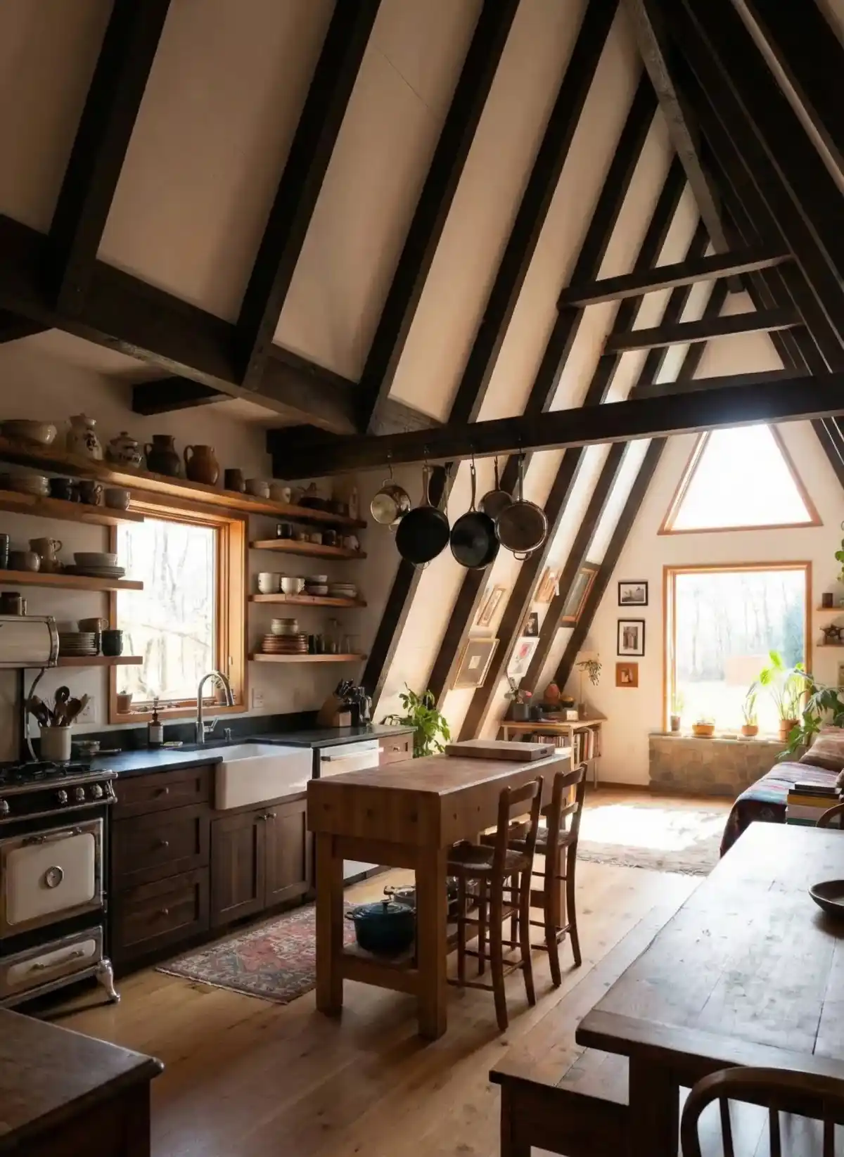
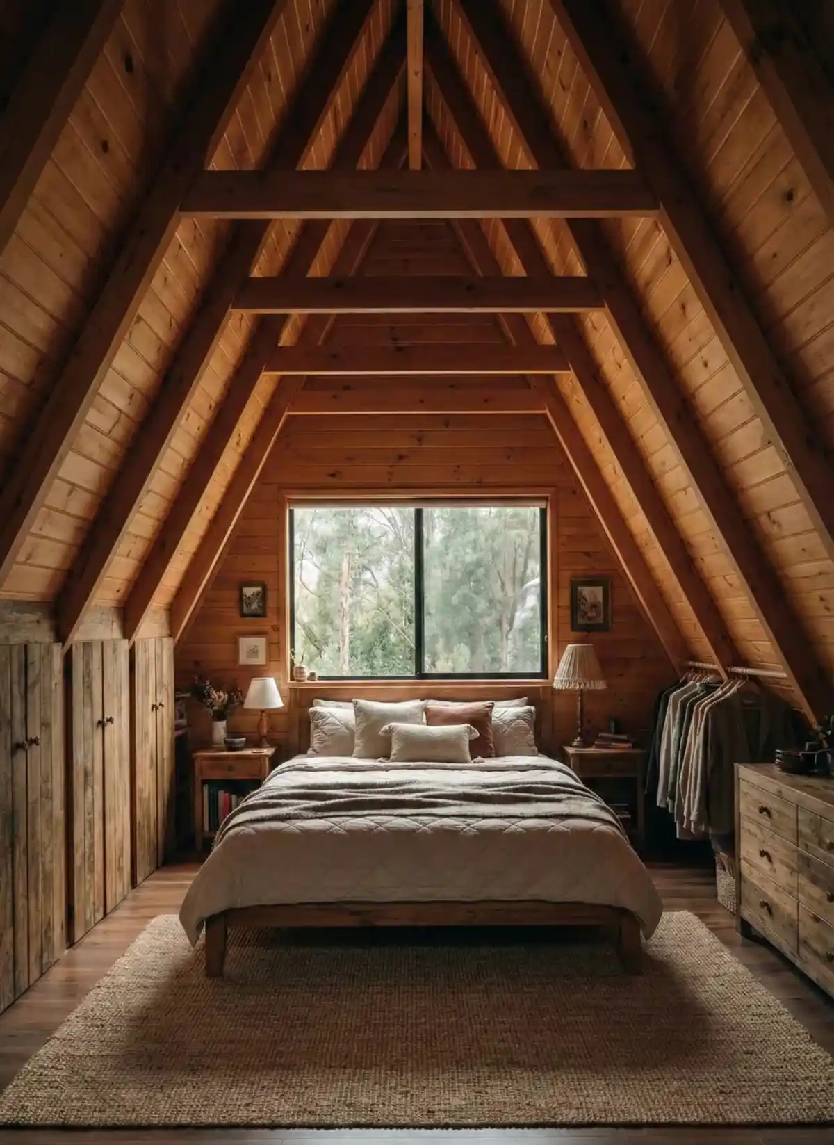
5. Classic Timber & Leather Lodge Living Room – Embracing Rustic Warmth in Modern Design
Nothing screams “weekend getaway” quite like an abundance of knotty pine and the crackle of a wood stove. Golden tones from the floor-to-ceiling wood paneling envelop the room, creating an insulating cocoon that feels safe and secluded from the outside world.
Dark, exposed beams slice through the angled walls, providing necessary contrast and emphasizing the dramatic structural geometry unique to A-frame architecture.
Anchoring the space, a freestanding wood-burning stove serves as the functional heart of the home, promising heat and ambiance during chilly evenings. Leather furniture and wicker accents bridge the gap between rugged durability and casual comfort, proving that a space can be traditionally rustic without feeling outdated.
Tunnel Layout: Furniture is arranged to maintain a clear pathway, drawing the eye through the living area toward the dining space in the back.
Structural Contrast: Dark stained beams break up the expanse of light wood paneling, adding depth and visual rhythm to the sloped walls.
Focal Point Heating: A classic black wood-burning stove sits on a tiled hearth, acting as both a heater and a nostalgic centerpiece.
Loft Integration: A visible loft area with white trim adds a layer of vertical interest and maximizes the usable square footage in the peak of the house.
Textural Mix: Smooth leather sofas paired with woven wicker chairs create a tactile variety that softens the heavy wood surroundings.
6. Industrial-Chic Open Concept Living – Modern Flow for Classic Structures
Smart layouts are essential when dealing with the quirky geometry of steep rooflines, and this interior masterfully conquers the challenge of narrow A-frame footprints. Installing a floating staircase with open risers and black metal stringers turns a functional necessity into a sculptural element that keeps sightlines completely unobstructed.
Light travels freely from the kitchen window all the way to the cozy lounge area, preventing the space from feeling cramped or compartmentalized.
Dark structural beams create a bold graphic skeleton against the lighter honey-toned wood paneling, adding immediate architectural drama. A charcoal kitchen island grounds the open floor plan, offering a cool, modern counterpoint to the warm timber envelope while serving as the perfect social hub for après-ski snacks.
Textural Layering: Plaid throws and leather poufs introduce necessary softness to balance the metal and wood.
Visual Transparency: Open-riser stairs maintain visual continuity between the kitchen and living zones.
Color Blocking: Dark grey kitchen cabinetry creates a modern anchor in an otherwise wood-dominant room.
Defined Zones: A large, neutral area rug clearly separates the lounge space from the high-traffic walkway.
Beam Emphasis: Staining the structural A-frame beams a darker shade highlights the iconic geometry.
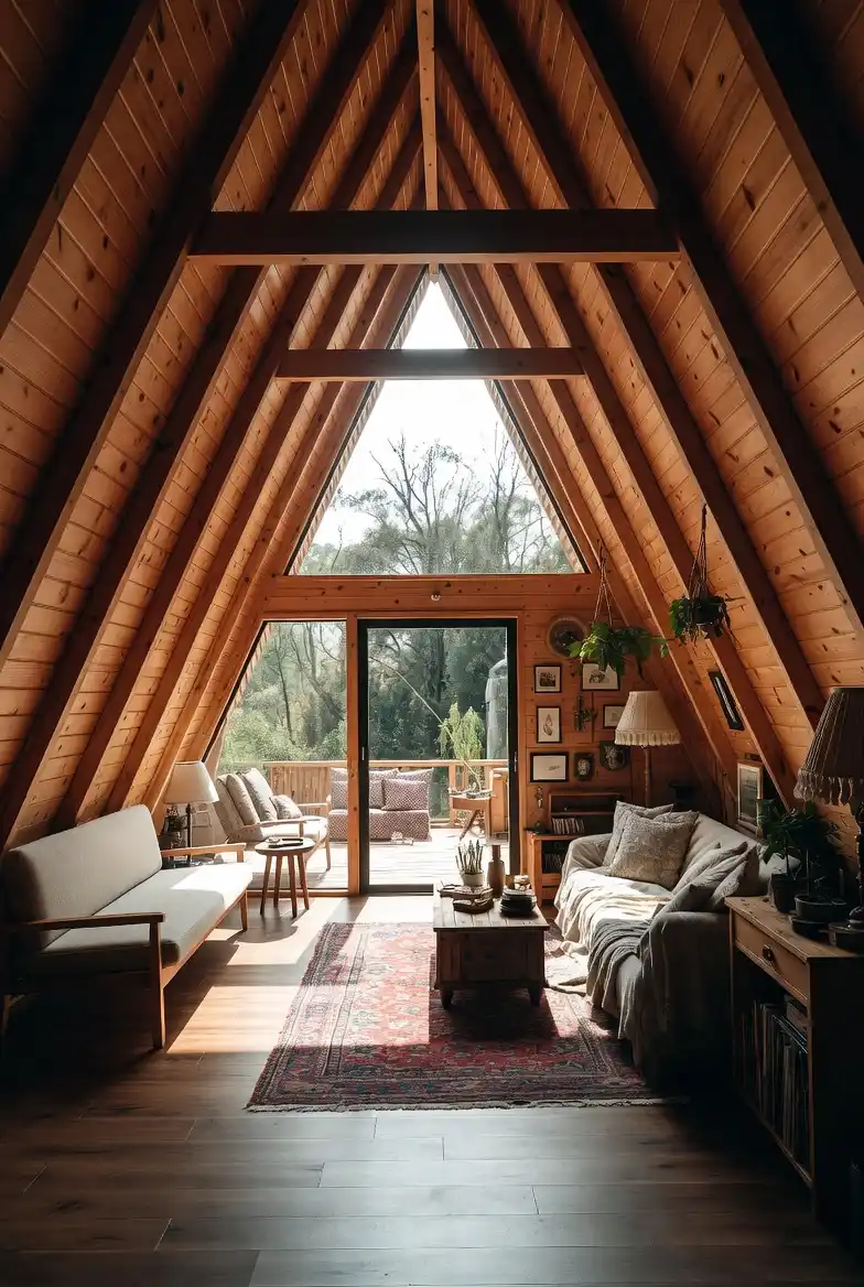
7. Sun-Drenched Eclectic Library Nook – Maximizing Character in A-Frame Living
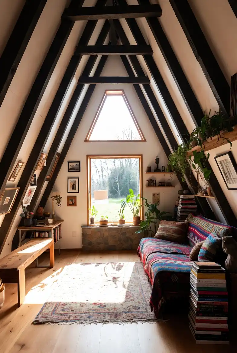
Painted white drywall between those striking dark trusses creates such a brilliant backdrop for personal expression, instantly modernizing the rustic bones of the structure. Leaning into a “curated clutter” or cozy maximalist philosophy works surprisingly well in tight triangular spaces because it draws the eye down to the human level—the comfort zone—rather than just getting lost in the soaring ceiling.
Stacking books right on the floor and draping vibrant, heavy textiles over the seating suggests a space designed for leisurely, unhurried Sundays, not just pristine photo ops.
Vertical Gallery: Slanted walls usually pose a headache for hanging art, but wedging eclectic frames between the beams turns the structural limitations into a curated gallery wall that feels intentional.
Textile Warmth: Vibrant, pattern-heavy throws and a faded vintage rug inject necessary soul into the bright white space, preventing the clean, modern finish from feeling sterile or cold.
Structural Shelving: Utilizing the depth of the trusses to anchor floating shelves allows for trailing plants to soften the sharp, rigid geometric angles of the roofline.
8. Golden Wood & Vintage Living Area – Blending Mid-Century Vibes with Rustic Structure
Wraparound wood paneling creates such an intense feeling of warmth that you almost expect the room to smell like cedar and old books before you even step inside. Instead of fighting the monochromatic amber tones with stark contrasts, leaning into the glow with beige upholstery and vintage accents makes the whole cabin feel incredibly cohesive.
Proving you don’t always need white paint to make a space feel open, the design relies heavily on that massive glass facade to let the forest do the heavy lifting.
Nature as Decor: Floor-to-ceiling glazing frames the outdoor greenery so perfectly that the trees become a permanent part of the interior design scheme, saving you from needing to fill every wall with art.
Defining the Zone: Throwing down a traditional Persian-style rug creates an island of color that instantly centers the room, stopping the furniture from feeling like it’s floating aimlessly on the wood floor.
Scale Awareness: Opting for low-slung, mid-century seating prevents the room from feeling cramped, as taller furniture would awkwardly clash with the descending roofline.
9. Hybrid Wood & White Studio Loft – Bridging Minimalist and Maximalist Styles
Split-personality rooms are rarely this successful, but here, treating the opposing walls differently actually solves the “too much wood” versus “too boring” debate instantly.
Keeping one slope crisp white reflects natural light to open up the cramped A-frame angles, while the opposing timber wall preserves that essential cabin nostalgia. It is a brilliant layout strategy for multi-purpose spaces, proving you don’t need to commit to just one aesthetic.
Zoning by Texture: Shoving the sleeping quarters against the quiet, clean white wall creates a calm visual pocket for rest, whereas the busy, warm wood wall anchors the high-energy living and working area.
Pattern Play: Laying down clashing rugs—a wild zebra print for the beds and a traditional red runner for the lounge—defines the separate functional areas on the floor better than a physical room divider ever could.
Structural Accents: Painting the structural beams black on the wood side adds a necessary industrial edge that stops the pine from looking dated, tying in perfectly with the modern window frames.
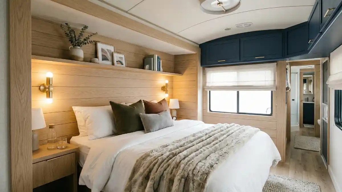
9. Gallery White & Tribal Texture Bedroom – A Minimalist Shell with a Maximalist Heart
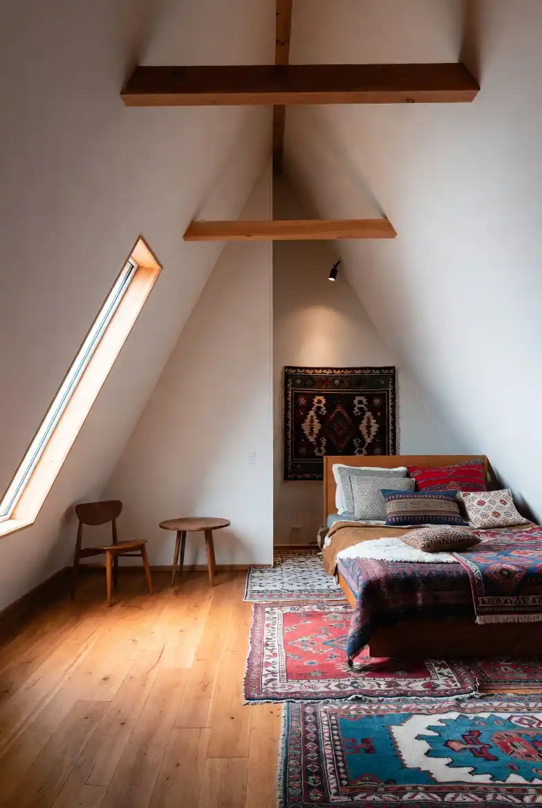
Stripping the walls down to a stark, gallery-white finish might seem counterintuitive for a cozy cabin—I mean, usually, you expect timber everywhere—yet here it creates the perfect silent backdrop for the loud, beautiful chaos of those textiles.
It is rare to see a space that feels this airy while still packing a punch of color, but keeping the architecture silent allows the bedding and rugs to do all the talking. Honestly, the restraint shown in the furniture selection—just a simple chair and tiny table—is what keeps this from tipping over into cluttered territory, proving you don’t need to fill every corner to make a room feel complete.
Soft Headboard Hack: Hanging a heavy woven rug behind the bed is such a smart, budget-friendly alternative to a traditional headboard; it adds instant height and softness without requiring any carpentry.
Visual Anchoring: Dark wood cross-beams prevent the high white ceiling from feeling like a void, visually connecting the two sides of the A-frame and drawing the eye up to appreciate the volume.
Floor Art: Layering multiple rugs at the foot of the bed adds texture and warmth where you need it most, effectively “shrinking” the large floor space to make the sleeping zone feel more intimate.
10. Two-Tone Timber & White Living Room – The Ultimate Compromise Between Chic and Rustic
Splitting the aesthetic literally down the middle is such a bold move, but it solves the biggest problem with A-frames: they can get incredibly dark. By keeping the left slope crisp and white, the room acts like a giant light reflector, bouncing sunshine from those massive skylights right onto the darker, moodier wood paneling on the opposite side.
I mean, it is basically a cheat code for anyone who wants the “log cabin” vibe without feeling like they are living inside a tree trunk.
Strategic Reflection: Placing the dining area against the white, windowed wall ensures your morning coffee is flooded with natural light, making the space feel twice as wide as it actually is.
Rough vs. Smooth: There is a satisfying tactile clash between the sleek, modern drywall and the raw, unpolished planks on the right; it stops the room from feeling too sterile or too “theme park” rustic.
Vertical Anchoring: Utilizing the dark, textured back wall to hang artwork draws the eye straight to the peak, celebrating the height of the room rather than letting it disappear into the shadows.
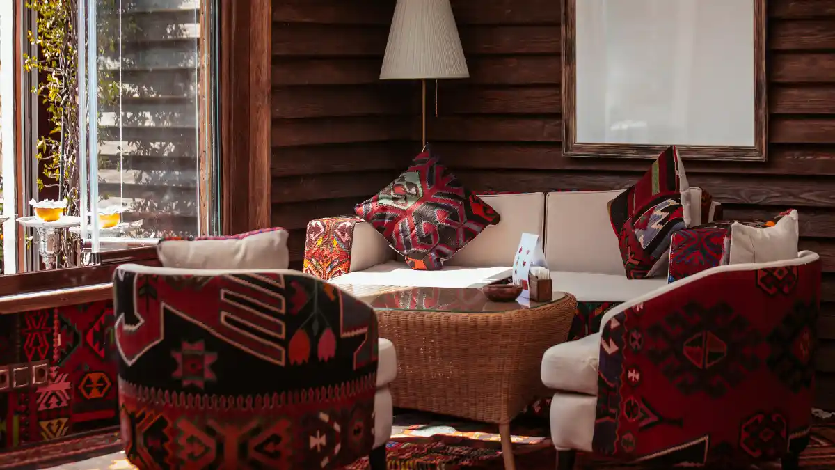
11. Panoramic Glass & Stone Hearth Living Room – Merging Industrial Structure with Tribal Warmth
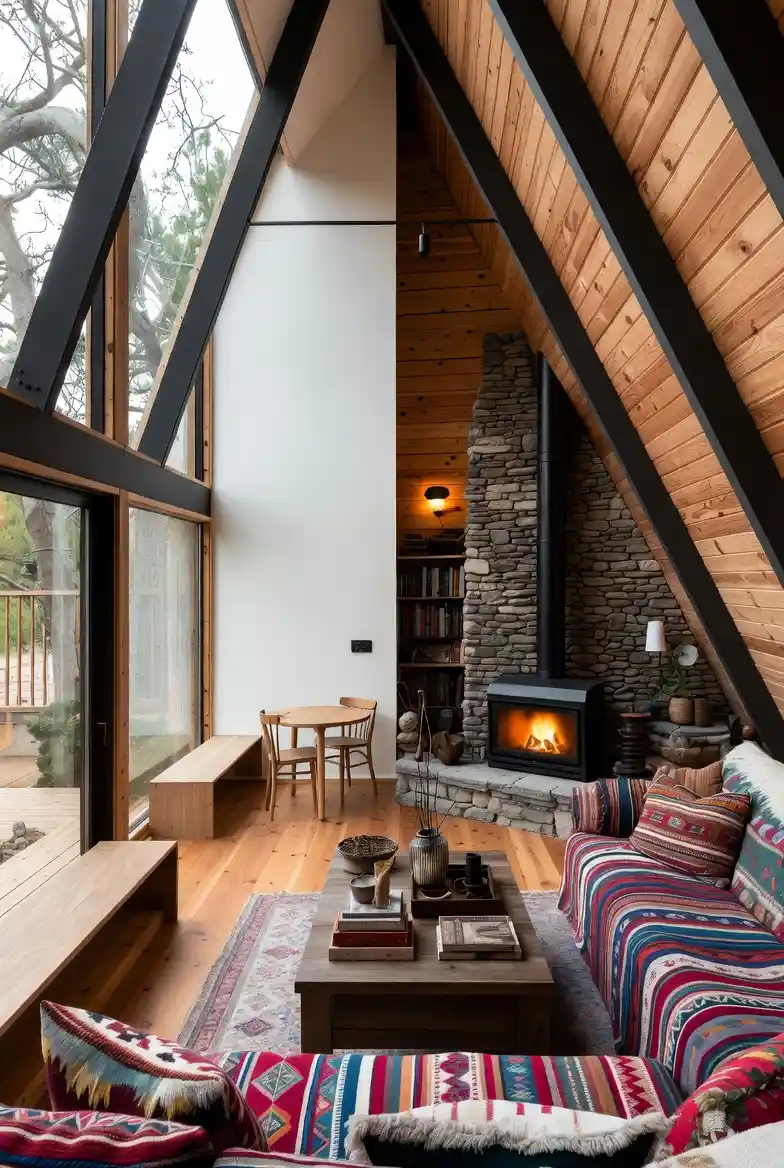
Massive floor-to-ceiling glazing usually runs the risk of making a room feel like a fragile fishbowl, but anchoring the space with that rugged, heavy stone fireplace creates an incredibly grounding counterweight.
It is fascinating how the stark black structural beams act as a picture frame for the forest outside, turning the view into dynamic art that changes with the seasons, rather than just being a “window.” Choosing a vibrant, pattern-heavy sectional sofa was a bold move that pays off because it injects immediate warmth and personality into what could otherwise be a cold, industrial-feeling layout.
Texture Overload: Mixing sleek glass, rough river stones, smooth pine, and woven textiles creates a rich sensory experience that makes the room feel expensive and curated without trying too hard.
Light Management: Keeping the window-side wall white reflects the daylight deep into the cabin, ensuring that even the cozy corner by the fire doesn’t feel gloomy or dark during the day.
Low-Profile Furniture: Sticking to a low back on the sofa and a simple, unobtrusive coffee table ensures that nothing competes with the soaring vertical lines of the architecture.
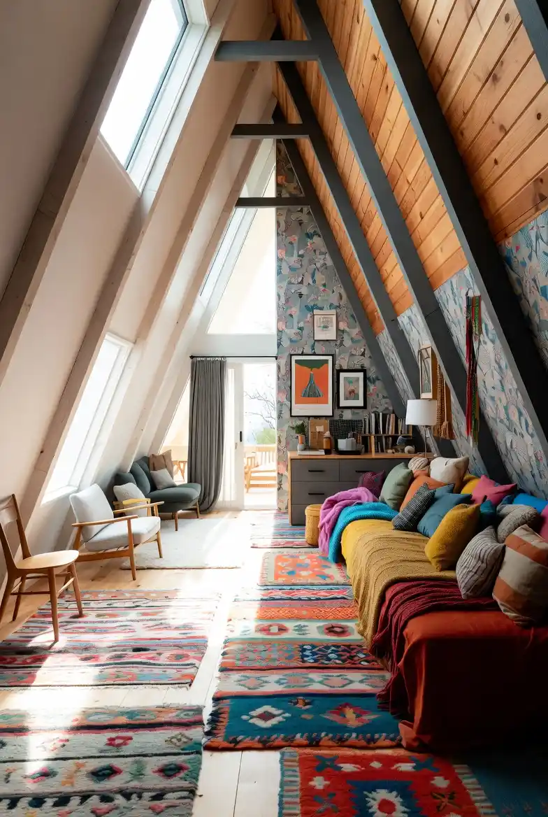
12. Vibrant Boho-Chic Sanctuary – Mastering Cozy Maximalism with Light and Layers
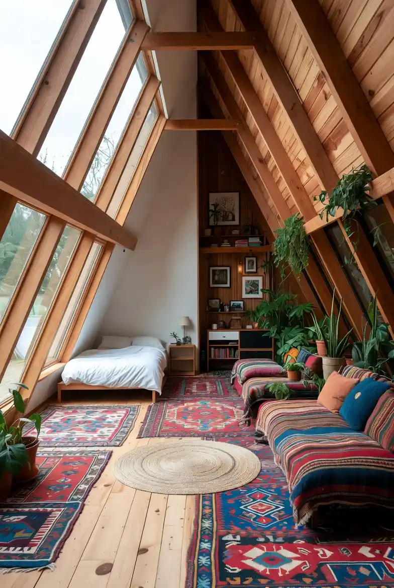
Drowning in sunlight from that incredible window wall is probably the best way to wake up, but what makes this space work is how it effectively balances that intense exposure with extreme, grounded coziness.
Instead of leaving the massive floor area bare and echoing, the aggressive layering of multiple patterned rugs creates immediate warmth and defines distinct zones without needing a single vertical wall. It is a masterclass in filling a high-volume, awkwardly shaped space with personality rather than just letting the architecture dominate.
Bed Placement Strategy: Tucking the low-profile bed right under the glazing is a gutsy move that pays off by making you feel like you’re sleeping outside, while simultaneously freeing up the central floor space for living.
Textile Overload: Covering nearly every square inch of the floor with overlapping Persian-style rugs is the ultimate anti-minimalist hack to add instant history, vibrant color, and essential sound dampening to a room full of hard surfaces.
Botanical Architecture: Utilizing the structural cross-beams as high-up plant shelves is brilliant because it draws the eye upward, emphasizing the room’s height while softening the rigid wooden triangle with organic green shapes.
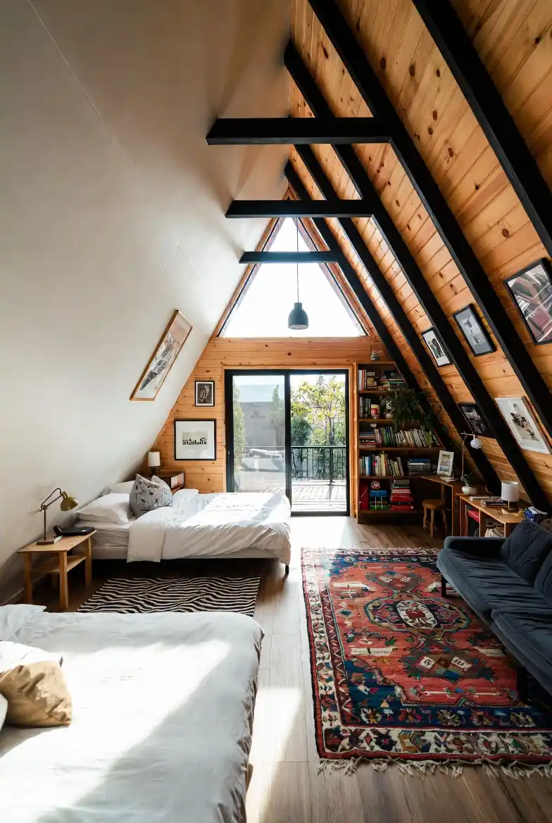
13. Multi-Level Pine Bunkroom – Maximizing Vertical Space for Group Getaways
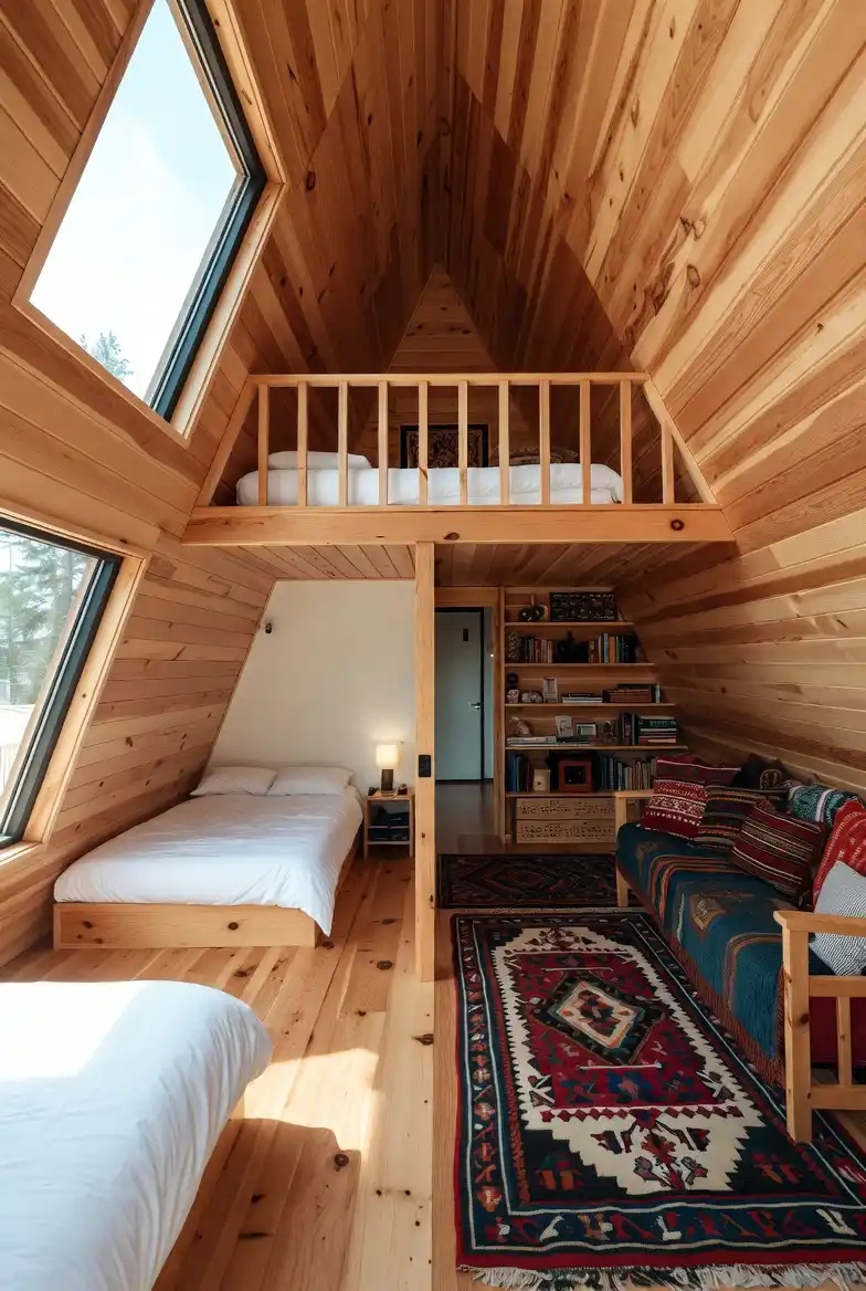
Fitting comfortable sleeping arrangements for five people into a single A-frame volume usually creates a claustrophobic nightmare, yet this split-level design manages to make it look effortlessly organized.
Relying on a simple central partition to separate the “quiet zone” from the “social zone” is a genius layout hack because it allows early risers to read on the sofa without instantly waking the people sleeping just a few feet away. I mean, the sheer amount of wood paneling here is intense, but the white bedding and bright skylights break it up enough to keep the vibe airy rather than suffocating.
Lofted Utility: Utilizing the absolute peak of the roof for a secondary sleeping deck transforms dead air space into a prime cozy nook, effectively doubling the occupancy without expanding the footprint.
Dead Space Solutions: Tuck-pointing custom shelves into the tightest, most awkward corner of the A-frame angle turns wasted floor space into a charming library, proving that structural quirks can actually be functional assets.
Defined Traffic Flow: Laying down runner rugs in the “living” half clearly marks the walking path and social area, visually separating it from the sleeping quarters better than a wall ever could.
14. Dual-Personality Design Lounge – Merging Scandi-Clean with Boho-Chaos
Honestly, seeing a room that refuses to pick a side is refreshing because most people think you have to choose between “clean” and “cozy,” but this space proves you can just have both.
Painting one slope white to bounce the light while covering the other in bold wallpaper and wood creates a dynamic tension that makes the room feel alive rather than just “styled.” It is a bit risky to mix such opposing vibes, yet the dark structural beams act as a zipper, holding the two aesthetics together perfectly.
Wallpaper Zoning: Tucking intricate blue wallpaper between the dark grey beams is such a clever way to add maximalist flair without it feeling cluttered, as the beams act like frames to contain the chaos.
Color Blocking: Piling mustard, teal, and pink cushions on the sofa creates a heavy visual anchor on the right, which perfectly balances the weightless, airy feel of the skylights on the left.
Rug Pathway: Laying down multiple runner rugs instead of one giant carpet drives the eye straight toward the balcony door, elongating the room and stitching the two contrasting styles together at floor level.
15. Yin & Yang Split-Zone Retreat – Mastering the Minimalist to Maximalist Divide
Seeing such a hard, literal line drawn between minimalism and maximalism in a single open space is jarring at first, but it’s actually an incredibly functional way to manage energy levels throughout the day.
On the left, you have this serene, cloud-like sleeping nook where the architecture disappears behind blinding white paint and massive skylights, forcing you to wake up and focus outward. Stepping across that threshold onto the rich wood floor on the right instantly shifts the mood to “hibernation mode,” where the textured rug, loaded sectional, and dark library wall wrap around you like a weighted blanket.
Defining the Divide: Instead of building a wall, the designer used a sharp transition in flooring material—from sleek white to warm timber—to psychologically separate the sleeping zone from the living area.
Apex Utilization: Shoving built-in shelving all the way into the darkest, highest point of the A-frame turns what could be a gloomy void into a cozy, intellectual focal point that anchors the lounge.
Lighting as Texture: While the sleeping side relies entirely on natural daylight to feel expansive, the lounge side uses warm, low-level lamp light to enhance the grain of the wood and create an intimate, enclosed atmosphere.
16. High-Contrast Structural Guest Suite – Balancing Clean Lines with Boho Warmth
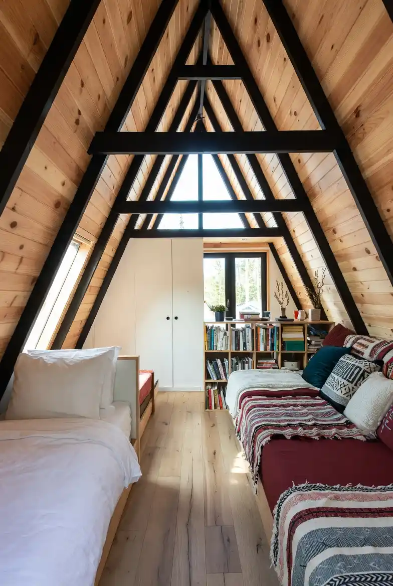
Painting those structural trusses a deep, matte black against the raw pine is such a confident move; it instantly frames the view and gives the eye something to latch onto in a sea of wood grain.
Squeezing two sleeping zones into such a narrow footprint could easily feel like a hallway, yet the alignment here makes it feel like a purposeful, symmetrical sanctuary. It is a brilliant example of how to merge the “scandi-minimalist” desire for order with the “boho-maximalist” need for texture and comfort.
Invisible Storage: Installing sleek, handle-less white cabinetry at the far end acts as a visual palette cleanser, hiding the inevitable vacation clutter while reflecting light back into the room to keep it feeling airy.
Graphic Framing: High-contrast black beams create a tunnel effect that naturally draws your gaze toward the window, making the room feel longer than it actually is while emphasizing the iconic A-frame geometry.
Dual-Purpose Furniture: Setting up the twin beds as deep daybeds with heavy throw pillows allows the room to function as a casual hangout lounge for reading during the day and a proper guest room at night.
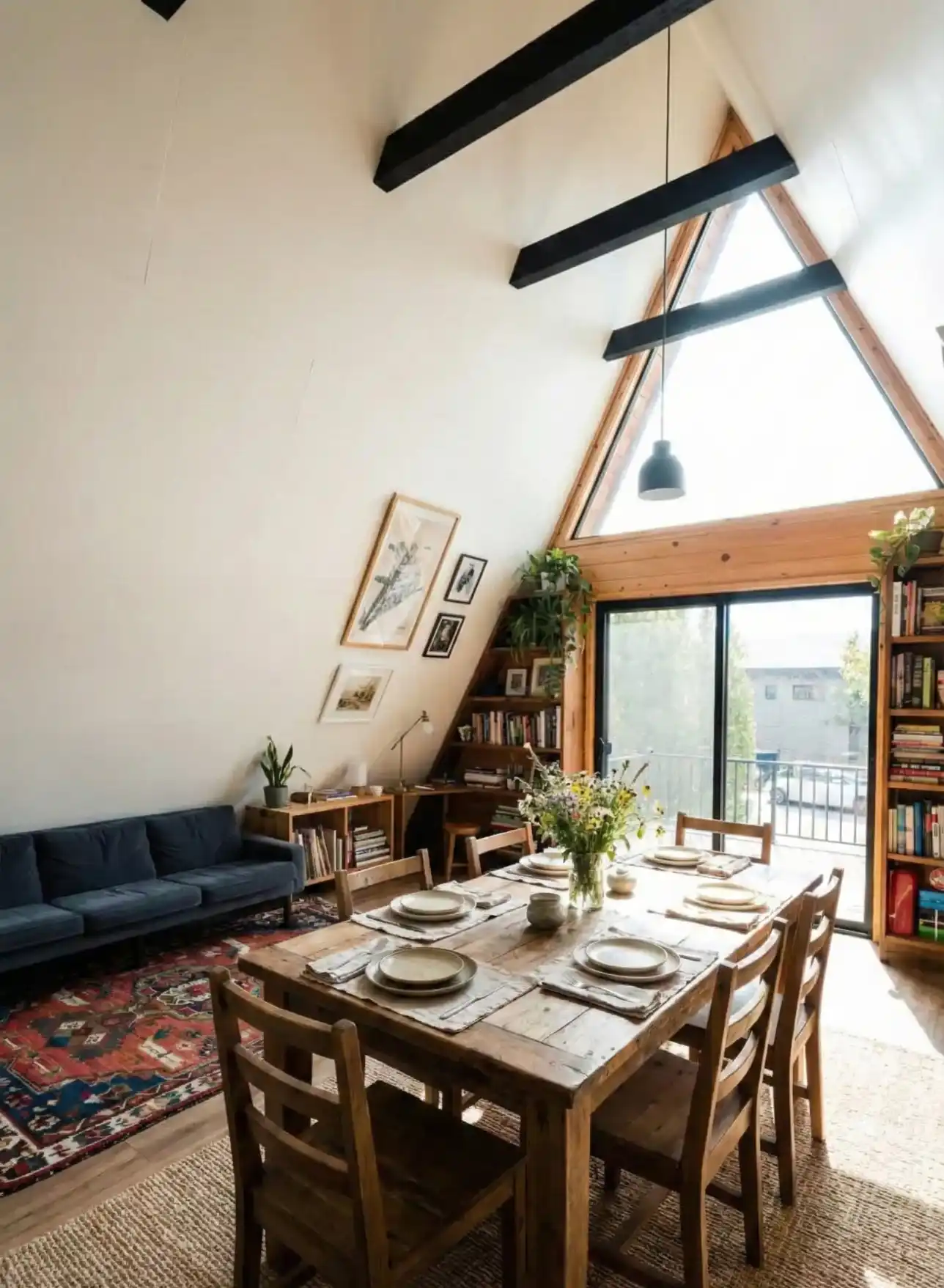
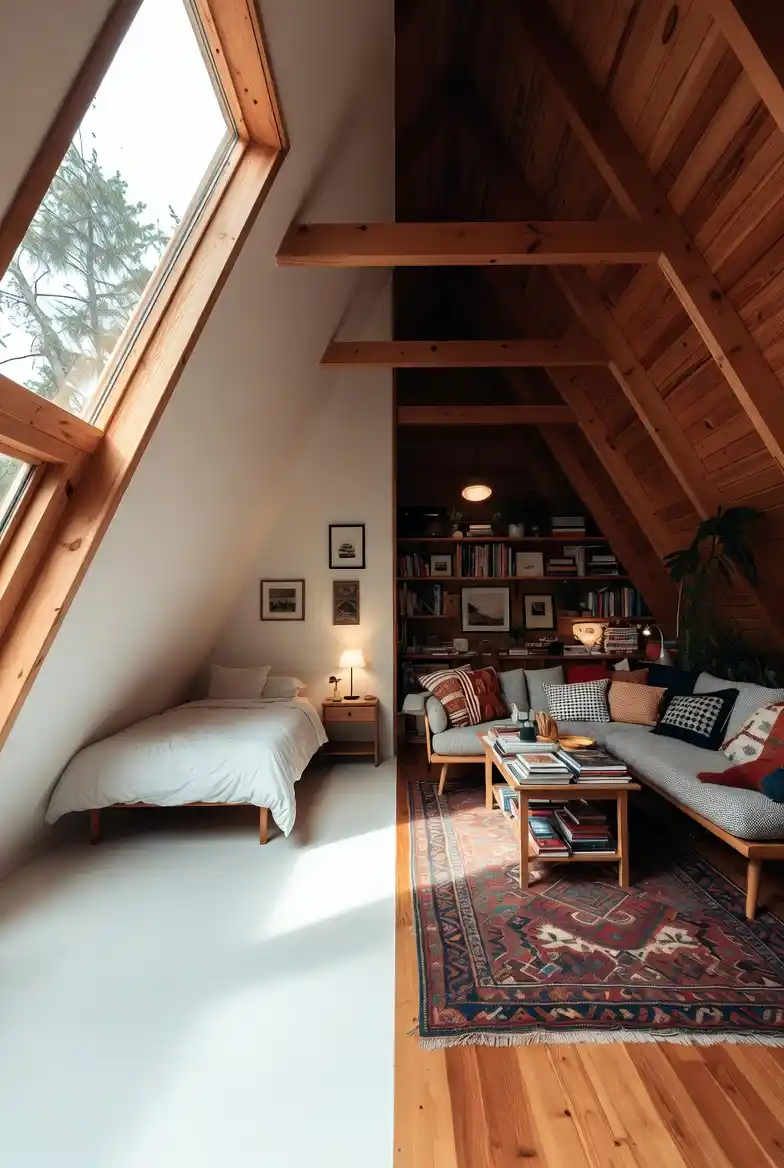
17. Natural Wood & White Gallery Suite – Achieving Quiet Balance in Open Layouts
Staring down the center of this room, the repetitive rhythm of the rafters is almost hypnotic, pulling your eye straight through the workspace and into the sanctuary of the bedroom.
It is rare to find a cabin that feels this disciplined; usually, they are cluttered with rustic kitsch, but here, the white drywall acts as a palette cleanser between each wooden rib. I mean, it is basically the architectural equivalent of a deep breath—clean, structured, and incredibly calming.
Sightline Strategy: Aligning the bedroom door perfectly with the peak creates a “tunnel vision” effect that makes the entire cabin feel endless rather than segmented, effectively borrowing light from the back room to brighten the front office.
Curated Corners: Wedging a custom bookshelf into the awkward triangular crawl space turns a potential dust trap into a functional library, proving that no square inch needs to be wasted even in the tightest eaves.
Gallery Focus: Treating the far bedroom wall as a focal point with a clustered art display draws you through the home, rewarding the eye for looking past the immediate workspace.
18. Charcoal Canvas & Plywood Narrow Lounge – Minimalist Structure Meets Maximalist Comfort
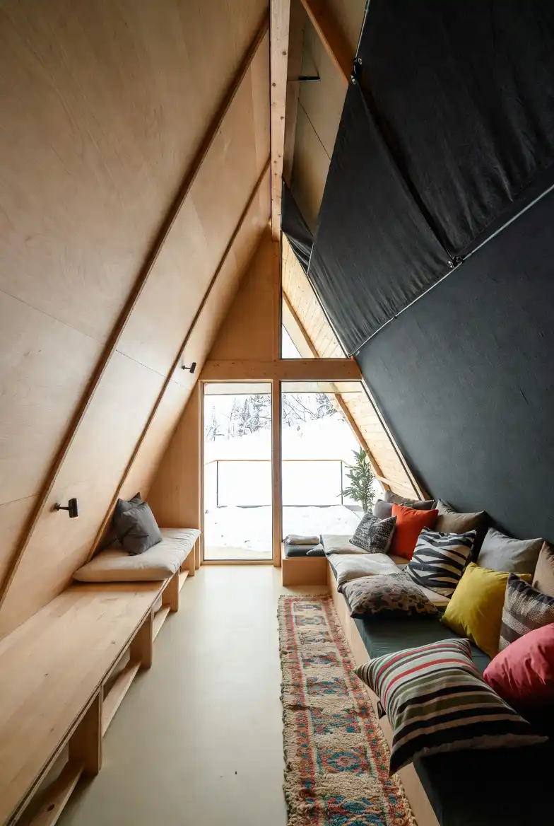
It looks a bit like a high-end tent inside a wooden shell, doesn’t it? Using that heavy, dark fabric—maybe it’s canvas or felt—on the right wall is such a dramatic choice because it instantly absorbs the light and makes that side feel incredibly enclosed and “den-like,” while the opposite plywood wall keeps things raw and bright. Mixing such utilitarian materials creates a space that feels temporary and permanent all at once, kind of like the ultimate glamping experience.
Corridor Living: Squeezing a full lounge setup into what is essentially a hallway is tricky, but building the furniture directly into the structure prevents the floor from becoming an obstacle course.
Textural Balance: Draping that dark material disrupts the monotony of the wood; it softens the acoustics and provides a moody backdrop for the explosion of colorful throw pillows.
Pillow Density: Stacking contrasting patterns—zebra, stripes, and solids—on the bench is the quickest way to inject “cozy maximalism” into a stark, industrial shell without needing to hang art or paint walls.